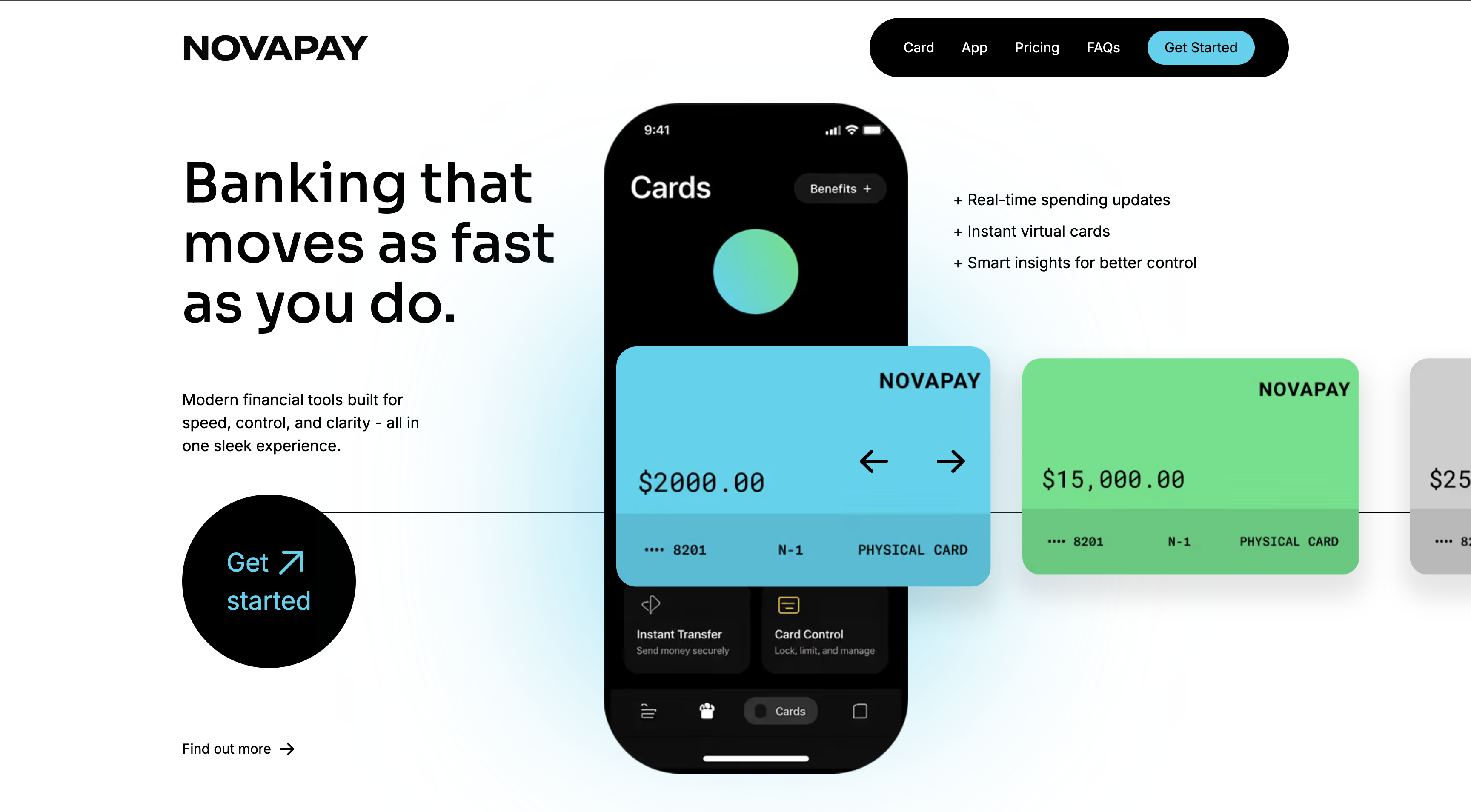
NovaPay is a conceptual fintech landing page redesign created to explore how strong visual hierarchy, product presentation, and modern UI styling can improve a brand’s perceived value. The goal was to create a homepage that feels fast, premium, and easy to understand from the first screen.
The main objective of this redesign was to build a landing page that communicates trust and innovation at the same time. In finance-related products, users need to feel clarity and control immediately. I wanted the design to feel bold and modern, while still keeping the content structured and easy to scan.
I built the page around three main ideas: clarity, contrast, and momentum.
Clarity came through a simple layout structure, clear section spacing, and direct messaging. Contrast came from combining a light overall page background with darker feature sections and bright card accents. Momentum came from the way the page flows from the hero section into product benefits, feature highlights, personalization, FAQ content, and a final strong call to action.
In this redesign, I focused on:
The hero section was designed to immediately communicate the product category and brand feel. Large typography gives the message weight, while the phone mockup and card visuals make the product feel real and interactive.
The dark feature cards help break the layout into clear content blocks and add visual depth. Bright cyan and green accents were used to create energy and help the design stand out, while still keeping enough simplicity for the page to feel polished instead of noisy.
The FAQ and CTA sections were kept clean and structured to support usability and create a strong ending to the page journey.
The final result is a modern landing page concept that feels visually strong and professionally structured. It presents the product more clearly, improves the overall user journey, and creates a more confident brand impression. This redesign also helped me strengthen my skills in layout composition, spacing, hierarchy, and building more polished UI concepts in Webflow.
Webflow
Figma-inspired layout thinking
Responsive layout design
Visual hierarchy and UI design principles
.png)