Deep dive into the architectural process of digital creation.
4 Case Studies
2025-present
bumiati-holdings-corporate-website
Bumiati Holdings Corporate Website
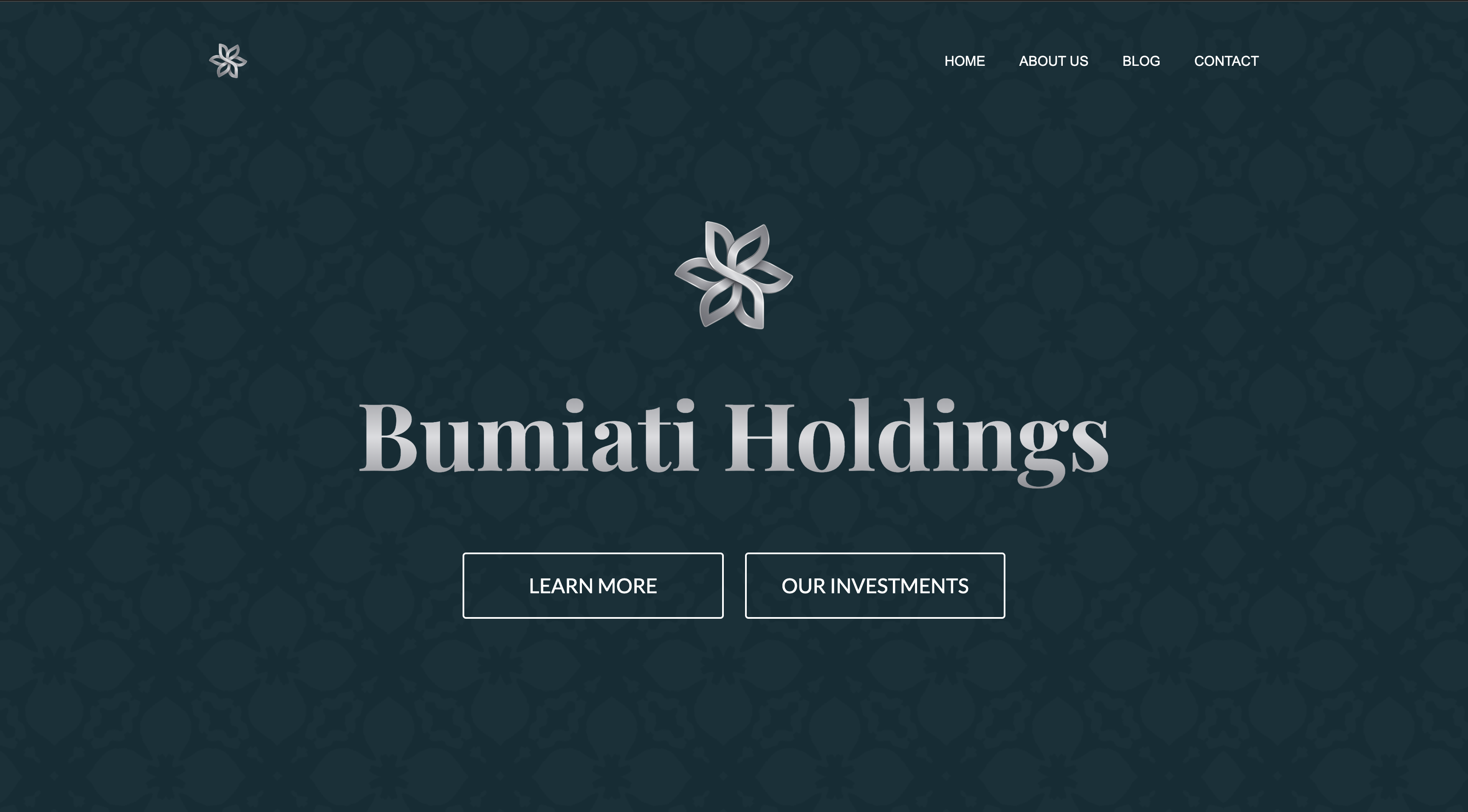
A corporate investment website designed to present multiple investment sectors with clarity, credibility, and structured content.
THe problem
Corporate investment companies often struggle to present multiple business sectors clearly while maintaining a professional and trustworthy brand image. Many websites in this industry appear outdated, overly complex, or difficult to navigate. The challenge was to design a corporate website that communicates credibility while clearly presenting the company’s different investment areas, including technology, real estate, agriculture, and international business events. The site needed to feel professional and structured while remaining easy to navigate.
the solution
I designed a structured corporate website focused on clarity, professionalism, and content organization. The layout introduces the company through a strong hero section and then clearly presents the company’s different investment sectors using card-based sections. A clean typography system and neutral color palette were used to reinforce credibility and professionalism. Each section of the page focuses on a specific part of the company’s activity, allowing visitors to quickly understand the company’s portfolio and investment focus. Additional sections such as company introduction, blog insights, and contact information help build trust and provide visitors with multiple ways to engage with the company.
the result
The final website presents the company’s investment portfolio in a structured and visually clear way. The design communicates professionalism while making it easy for visitors to explore different investment areas and understand the company’s focus. The project also demonstrates strong Webflow development practices including responsive layout design, structured components, and scalable page sections that can easily expand as the company grows.
SERVICES
Web Design, UI Design, Webflow Development, Responsive Design
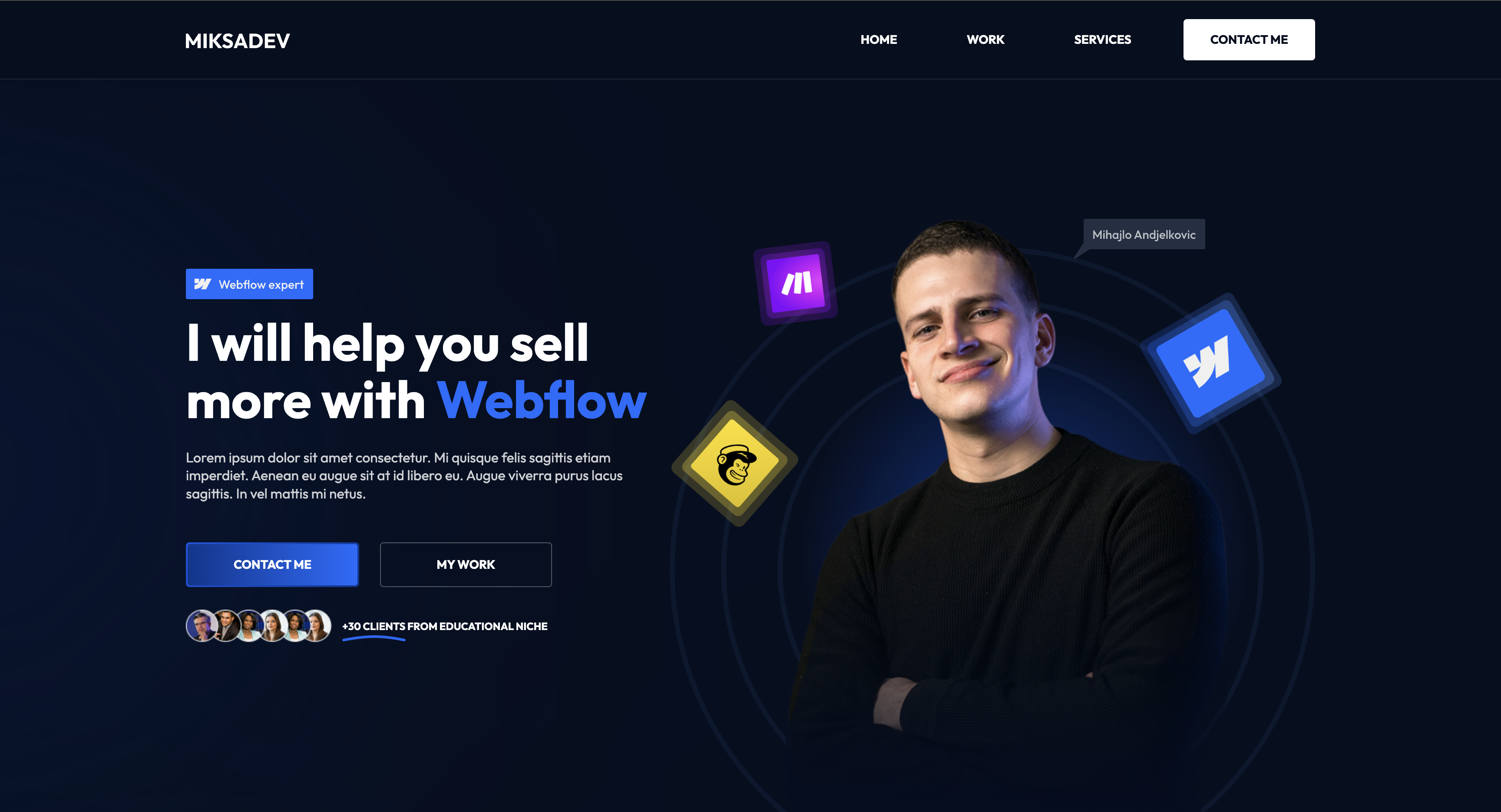
A personal Webflow portfolio designed to showcase services, case studies, and convert visitors into booked discovery calls.
THe problem
The goal was to design a personal portfolio website that clearly communicates services, builds credibility, and encourages potential clients to book a call. Many freelancer websites struggle with weak structure, unclear messaging, and poor visual hierarchy, which makes it difficult for visitors to quickly understand the value of the service being offered. The challenge was creating a portfolio that feels modern and professional while also guiding visitors smoothly through the page—from introduction, to portfolio work, to services, and finally to a strong call to action.
the solution
I designed and developed a conversion-focused portfolio website in Webflow with a clear structure and strong visual hierarchy. The layout was built to lead visitors through a natural flow: introduction, credibility, portfolio examples, services, and finally a clear call to action. The design uses a dark modern interface combined with blue accent colors to create a premium and technology-focused aesthetic. Large typography and clear spacing improve readability, while visual elements such as client logos, project cards, and section transitions help break up content and maintain engagement. Each section of the page has a clear purpose, ensuring that visitors quickly understand who the website is for, what services are offered, and how they can take the next step.
the result
The final result is a modern Webflow portfolio that presents services and projects in a clear and professional way while maintaining a visually engaging design. The structure helps guide visitors through the page and encourages them to book a discovery call. The website also demonstrates strong Webflow fundamentals, including responsive design, reusable components, and a scalable CMS structure for adding future projects and content.
SERVICES
UI Design, Web Design, Webflow Development, CMS Integration, Responsive Design
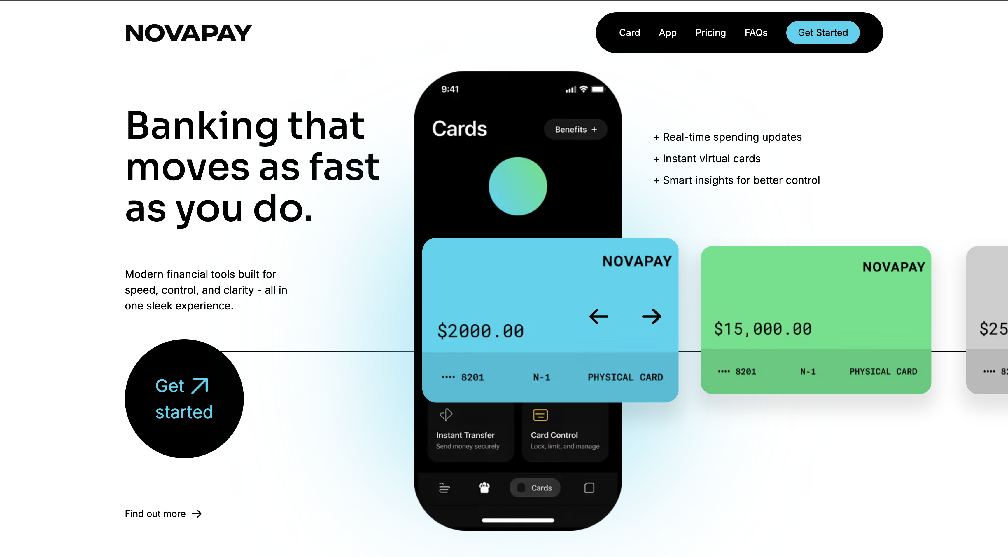
A sleek fintech landing page redesign built to improve clarity, trust, and product presentation.
THe problem
The original concept needed a stronger sense of structure, trust, and product clarity. For a fintech landing page, the design has to feel modern and visually impressive, but also simple enough for users to immediately understand the product, key benefits, and call to action. The challenge was creating a layout that felt premium and dynamic without becoming messy or overwhelming.
the solution
I redesigned the page with a cleaner visual system, stronger hierarchy, and more intentional section flow. I used bold typography, large product-focused imagery, dark feature cards for contrast, and bright accent colors to make key content stand out. I also structured the page to guide users from headline and product value, into features, personalization, FAQs, and final call to action. The result is a concept that feels more modern, polished, and conversion-focused.
the result
The final design feels sharper, more credible, and easier to scan. It presents the brand as modern and trustworthy while keeping the experience visually engaging. The redesign improved content flow, made the product benefits clearer, and created a stronger landing page concept that works well as a premium fintech case study in my portfolio.
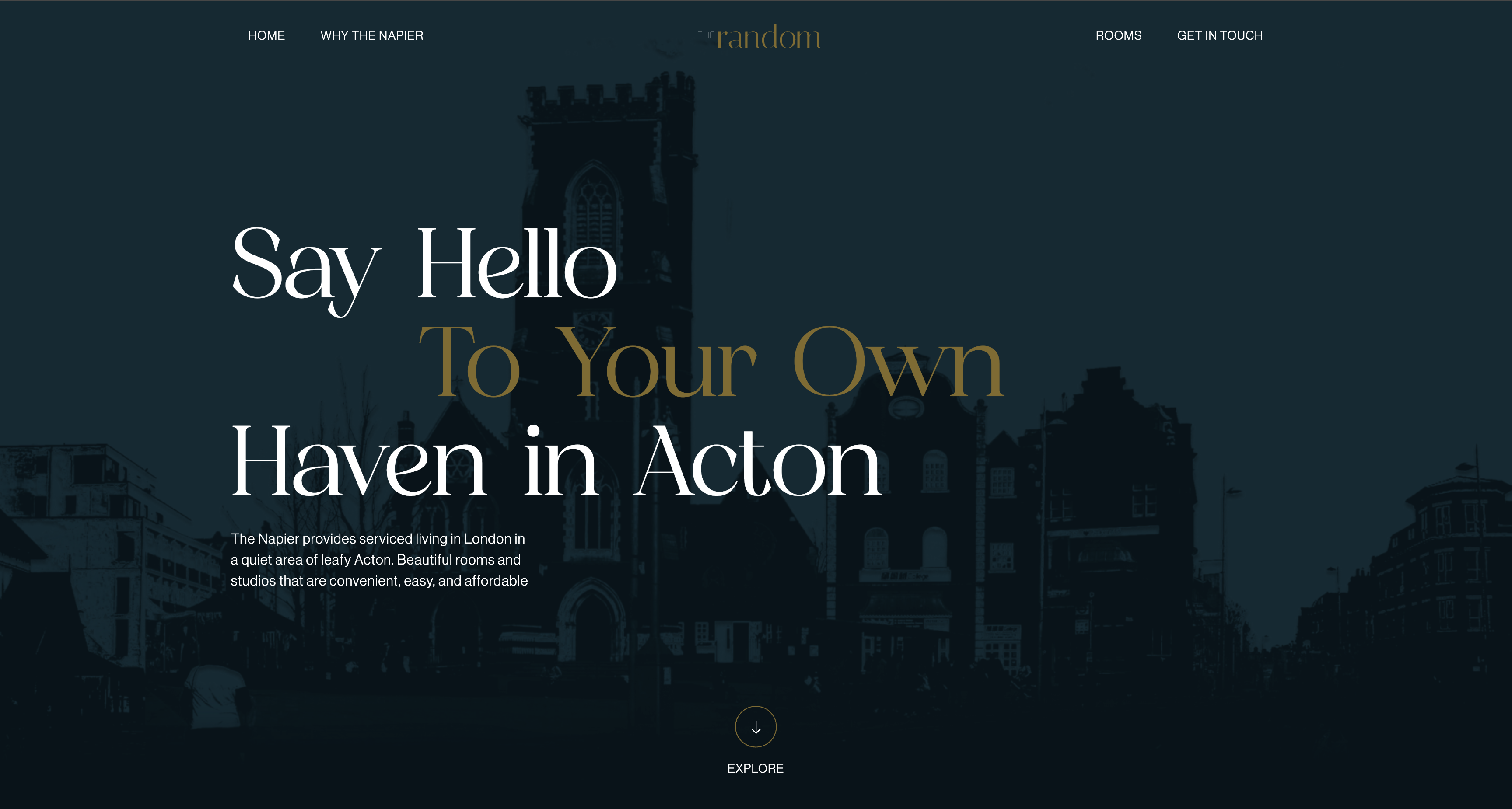
A modern website concept designed to showcase premium serviced living spaces in Acton with a strong visual identity and clear property information.
THe problem
Serviced living and property rental websites often struggle to balance aesthetics with clarity. Many property websites overwhelm visitors with information or fail to communicate the lifestyle and experience of the location. The challenge was to design a website that feels premium and welcoming while clearly presenting key information about the property, amenities, and location. The site also needed to guide visitors naturally toward booking a viewing or contacting the property.
the solution
I designed and developed a visually engaging landing page focused on storytelling and lifestyle presentation. The layout combines large imagery, elegant typography, and strong section structure to highlight both the living experience and the practical benefits of the property. A dark, sophisticated color palette paired with gold accents was used to create a premium aesthetic. Each section of the page communicates a specific aspect of the property experience, including convenience, lifestyle amenities, location, and practical living features. Clear calls-to-action and structured content help guide visitors through the page, making it easy for potential residents to explore the property and take the next step.
the result
The final result is a visually polished property website that presents the living experience in a clear and engaging way. The design communicates both the lifestyle and practical benefits of the location while maintaining a clean and modern layout. The website also demonstrates strong Webflow development practices, including responsive layout structure, reusable components, and scalable design patterns that allow the website to grow with additional content or property listings.
SERVICES
UI Design, Web Design, Webflow Development, Responsive Design